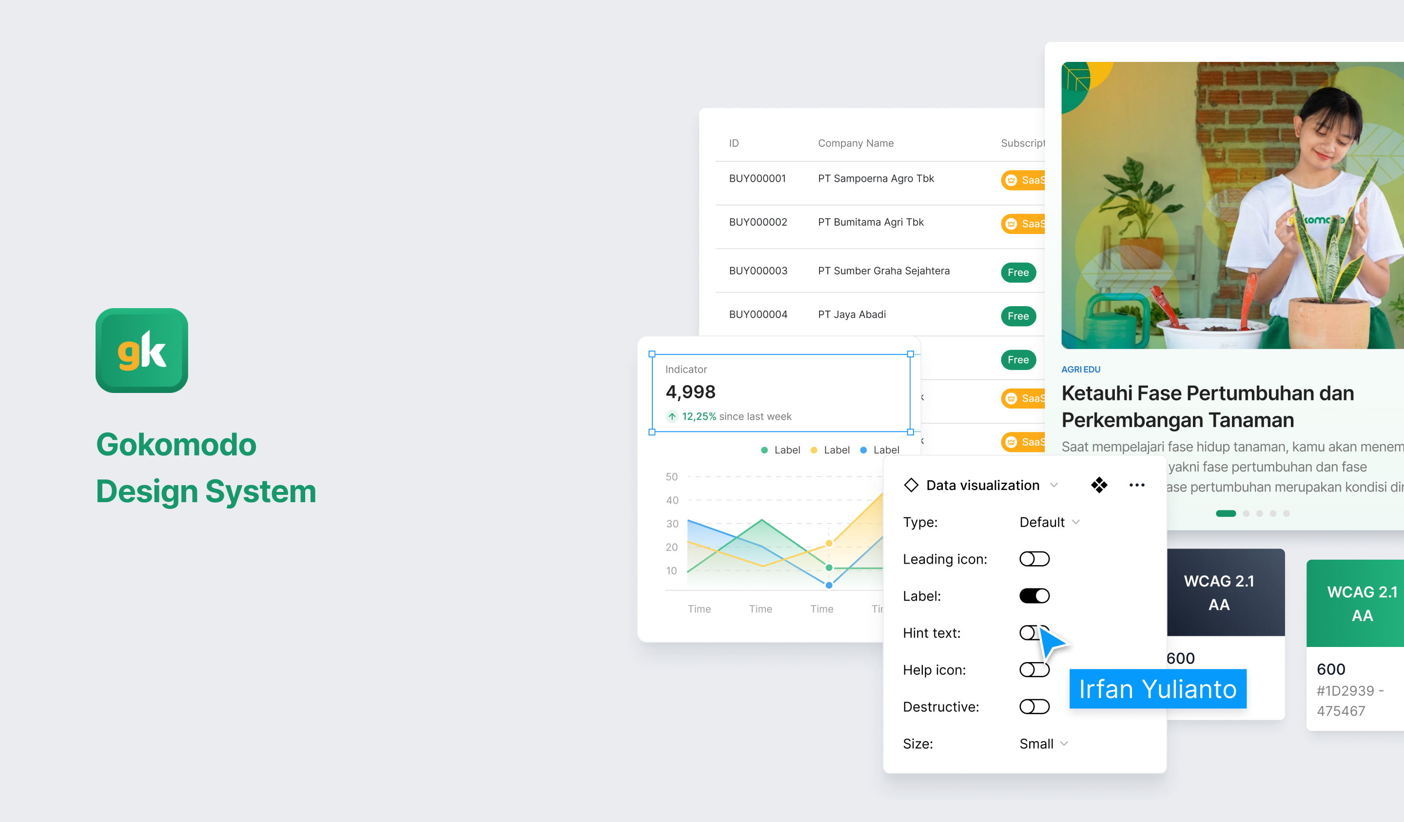
Empowering Gokomodo’s product designers productivity through multi-platform design system
Background & Challenge
After various product launches, we slowly realized that the brand guidelines provided by marketing are too limited for the extensive use of our products.
Lack of bandwidth. The idea of creating a design system has been a topic of discussion since I joined Gokomodo. However, only after we joined with only one Product Designer on the team, were we able to start working on it.
Gap between designers & developers
The Product Designer and Front End Developer at Gokomodo work with the system every day. Every visually appealing product has various issues behind it.
#Problem 1
Differences in color, typography, and icons among designers
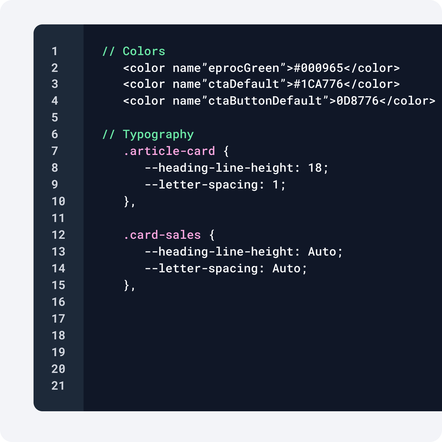
- Colors used by designers may vary in terms of the color code that appears to be the same.
- Typography may differ in terms of letter spacing or height.
- Icons are inconsistent in terms of border radius, stroke, and icon size within the interface.
#Problem 2
Developers often recreate components that look the same
Some developer behaviors in developing a design:
- Developers often adjust colors or typography from different designers, resulting in frequent recreation of color codes, typography, or new components such as buttons and cards.
- Having too much code also makes the development process longer because many similar types of components are recreated.
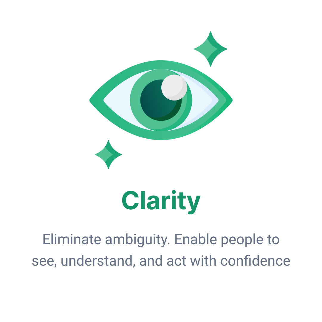
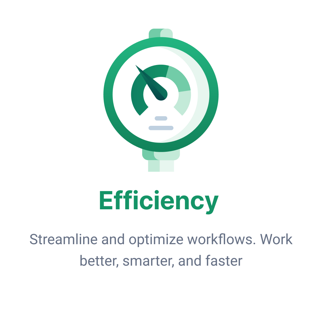
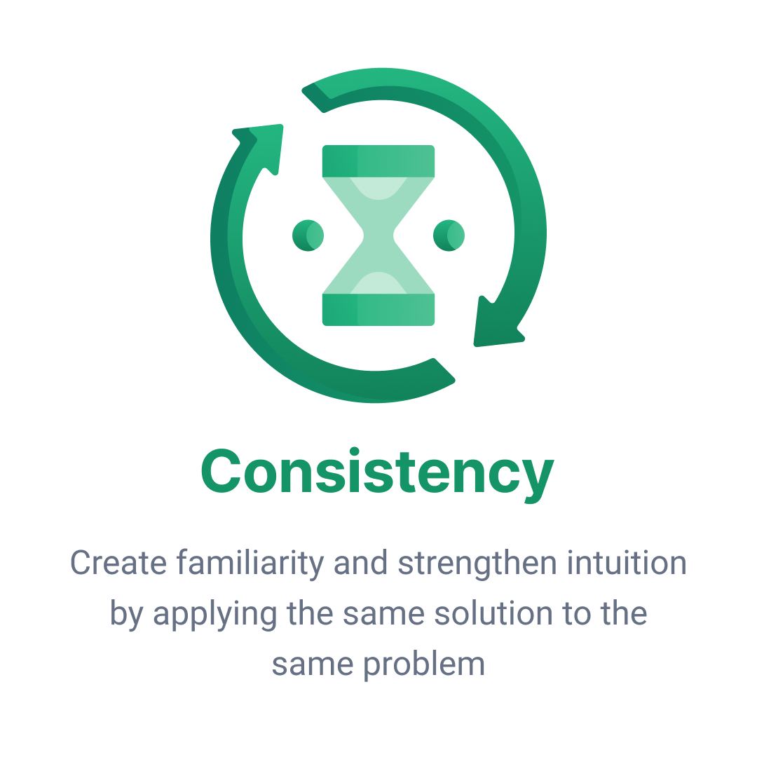
Project Goals
Improving design consistency and overall team productivity
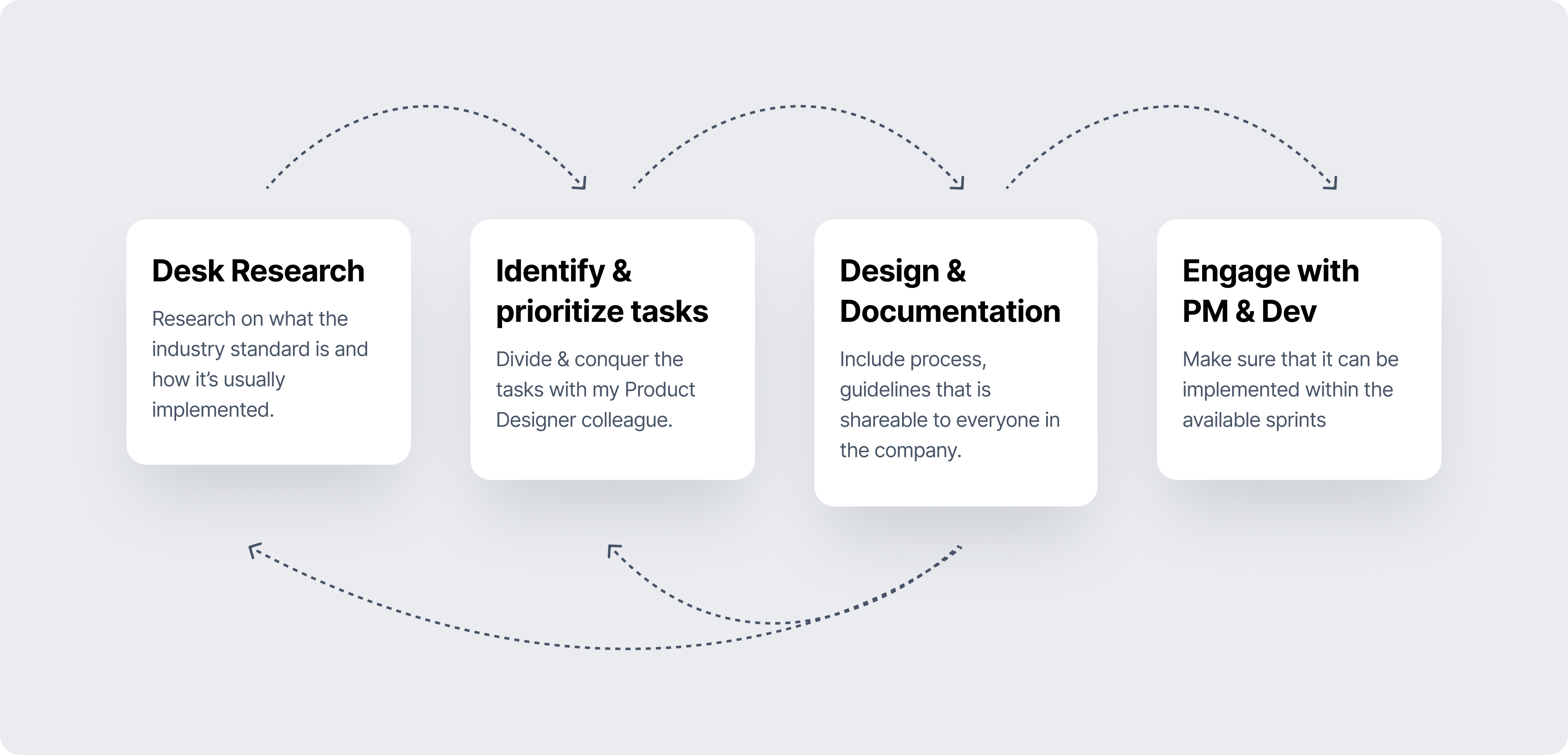
Process
The design process, starting from initial desk research to collaboration with developers, is carried out to ensure the alignment of each design component.
Benchmark with other design system
Reviewing literature on the various uses of design systems implemented in various companies:
- Principles used in creating design systems
- Development of components based on brand
- Documentation and guidelines for using the design system
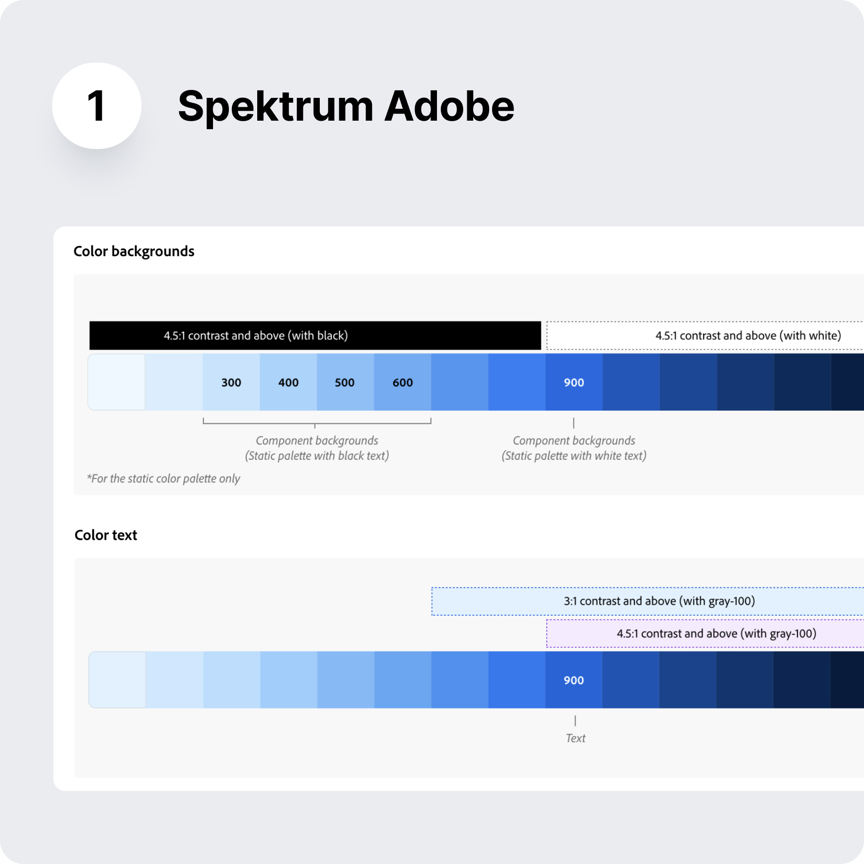
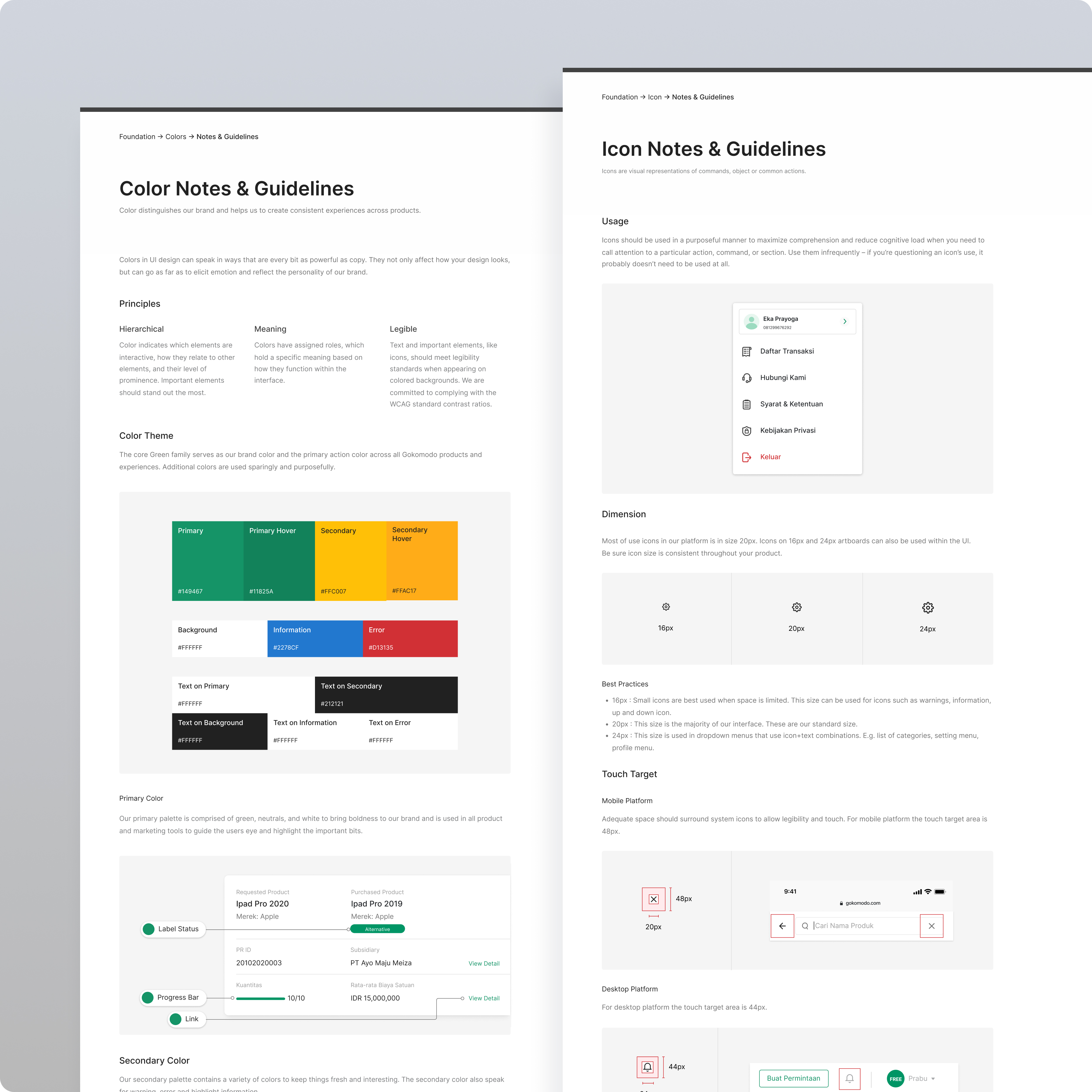
Color benchmark
My observations from Spectrum (Adobe):
- Creating colors derived from the brand and logo owned by the company.
- Colors include neutral, primary, secondary, and indicator (success, warning, and error).
- Dividing the color scale widely from 1-11 depending on the need. Creating color tokens ready for use as needed, such as specific colors for text, background, and so on.
- Ensuring color contrast meets WCAG standards
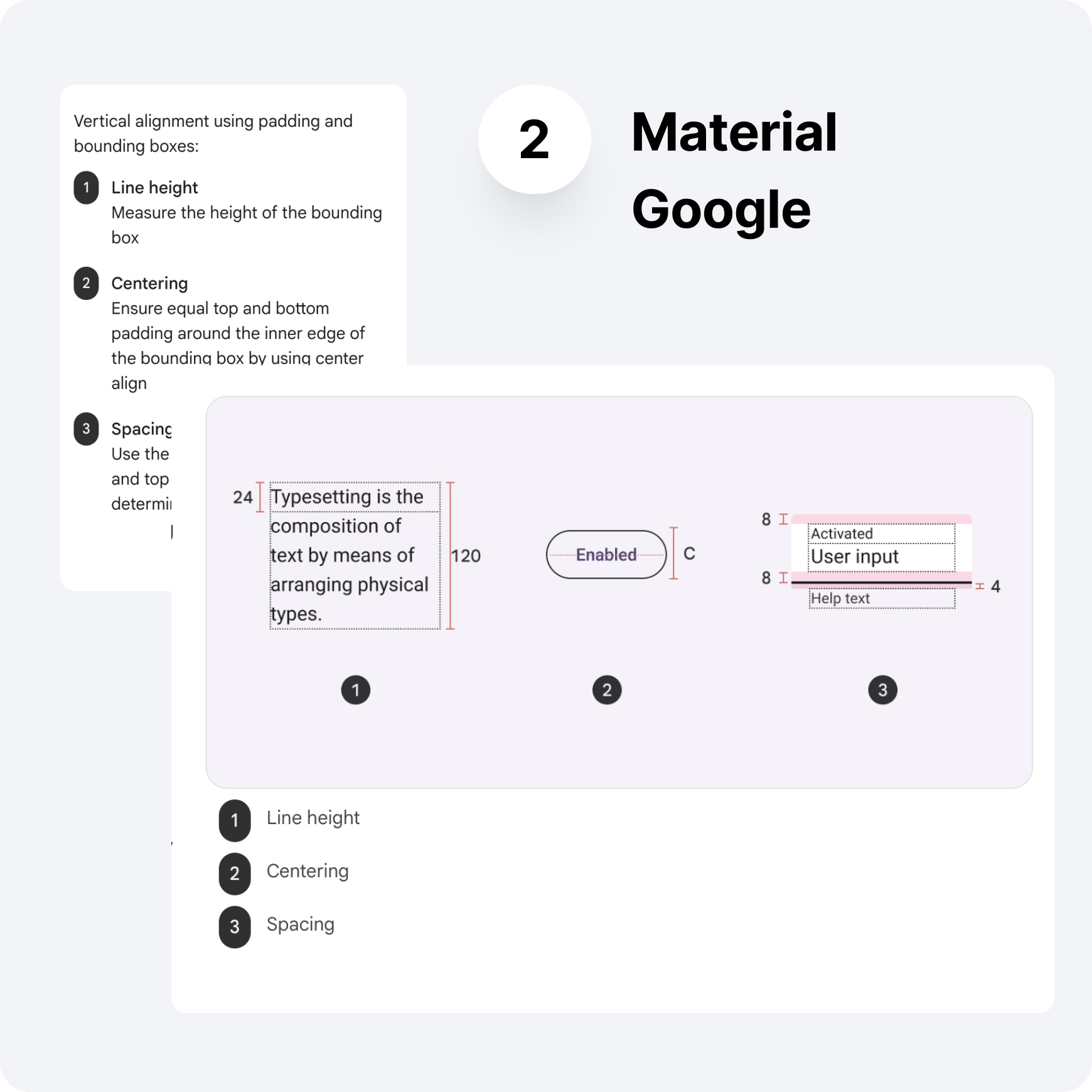
Typography benchmark
Things I've learned from Google typography:
- Determining fonts that reflect the brand's derivatives.
- Creating a typescale and tokens based on the needs to be used.
- Custom modifications for height, centering, and letter spacing.
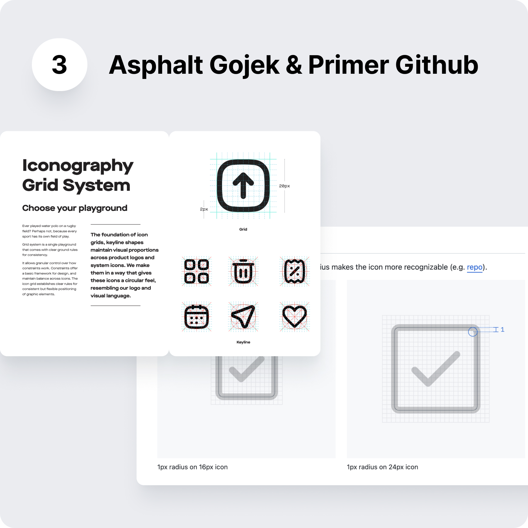
Icon benchmark
Observations on the icons of Gojek and GitHub:
- Determining the visualization style of icons that align with the company.
- Defining keylines for icons, strokes, border-radius, safe-padding, and so on.
- Creating icon guidelines for adding or creating new icons.
Designing principle
Gokomodo Design System principles:
Color exploration
Adjusting various color needs across all Gokomodo products for Corporate and Retail Tribes. It consists of 6 products across internal and external Gokomodo platforms.
Color exploration and brainstorming with Design System team
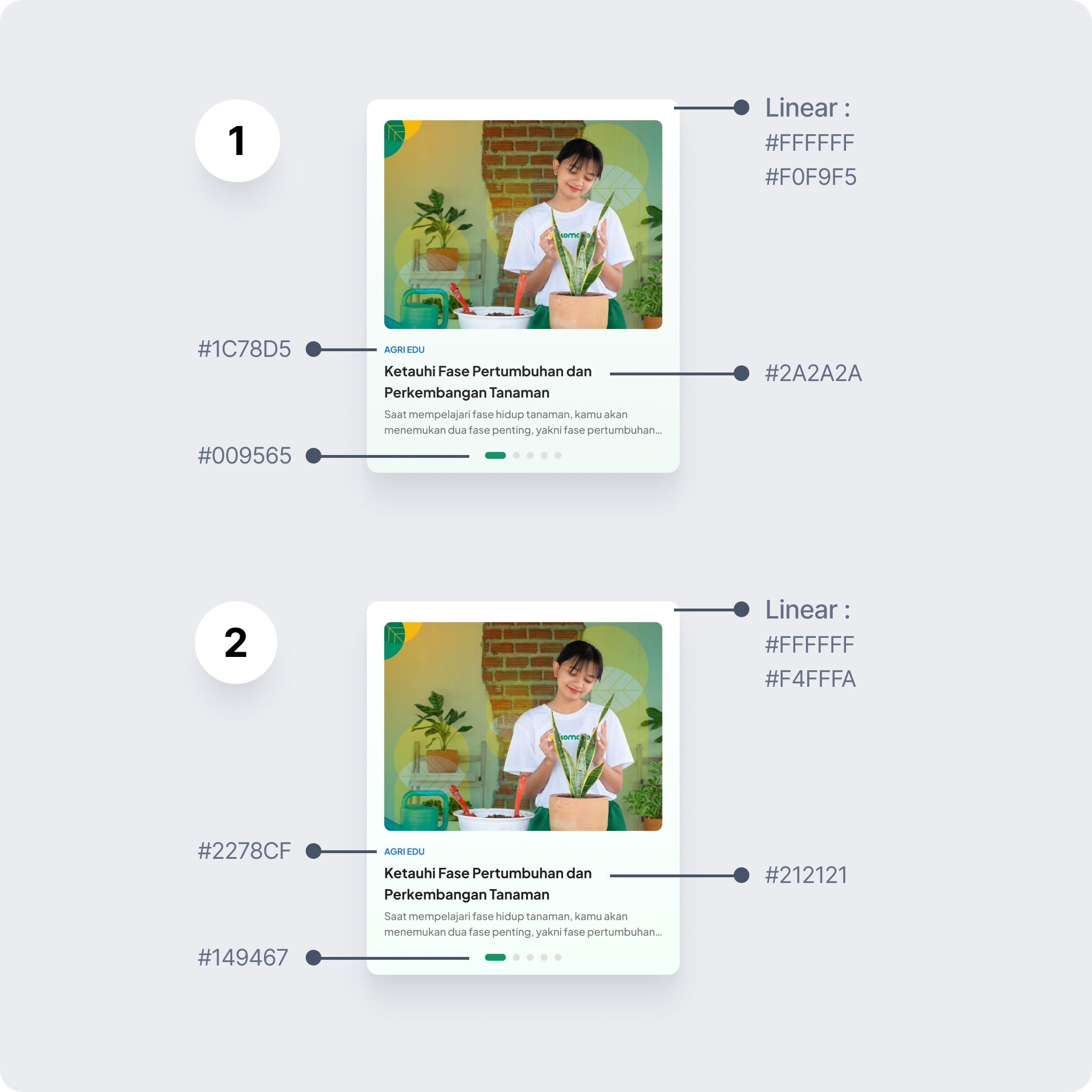
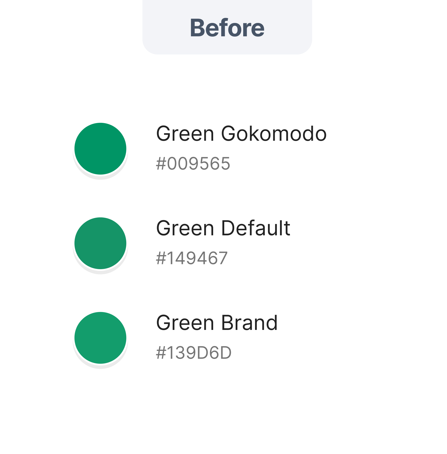
Old color & new color
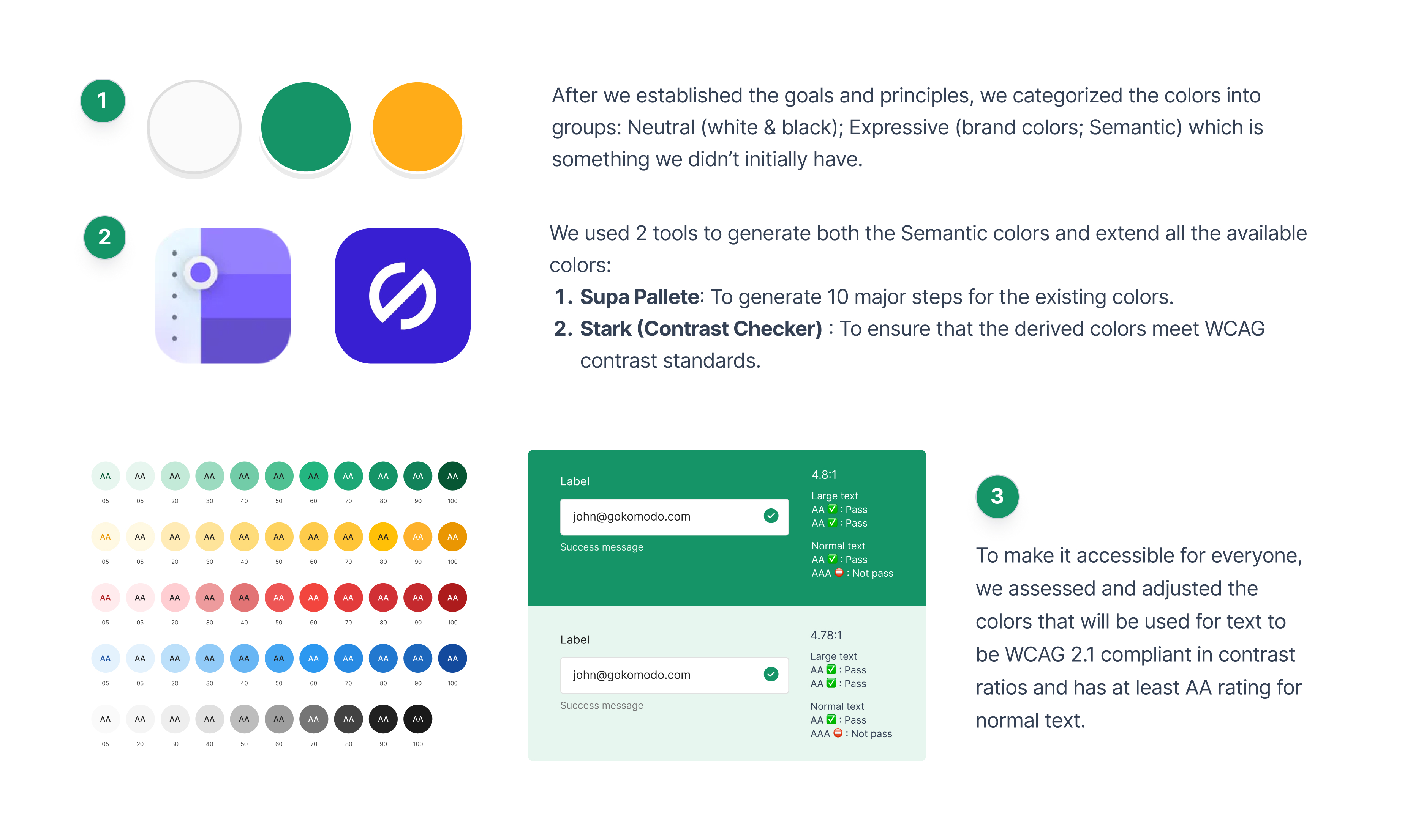
The colors of the design system are derived from the brand and adjusted to a scale of 1-10:
- Adjusting color tokens according to the needs of the products within Gokomodo
- The types of color needs include primary, background, surface, border, text, action, and so on.
- Colors are adjusted to WCAG contrast standards and Gokomodo brand derivatives.
The color codes can still different between designers
The usage tokens of colors are still unclear
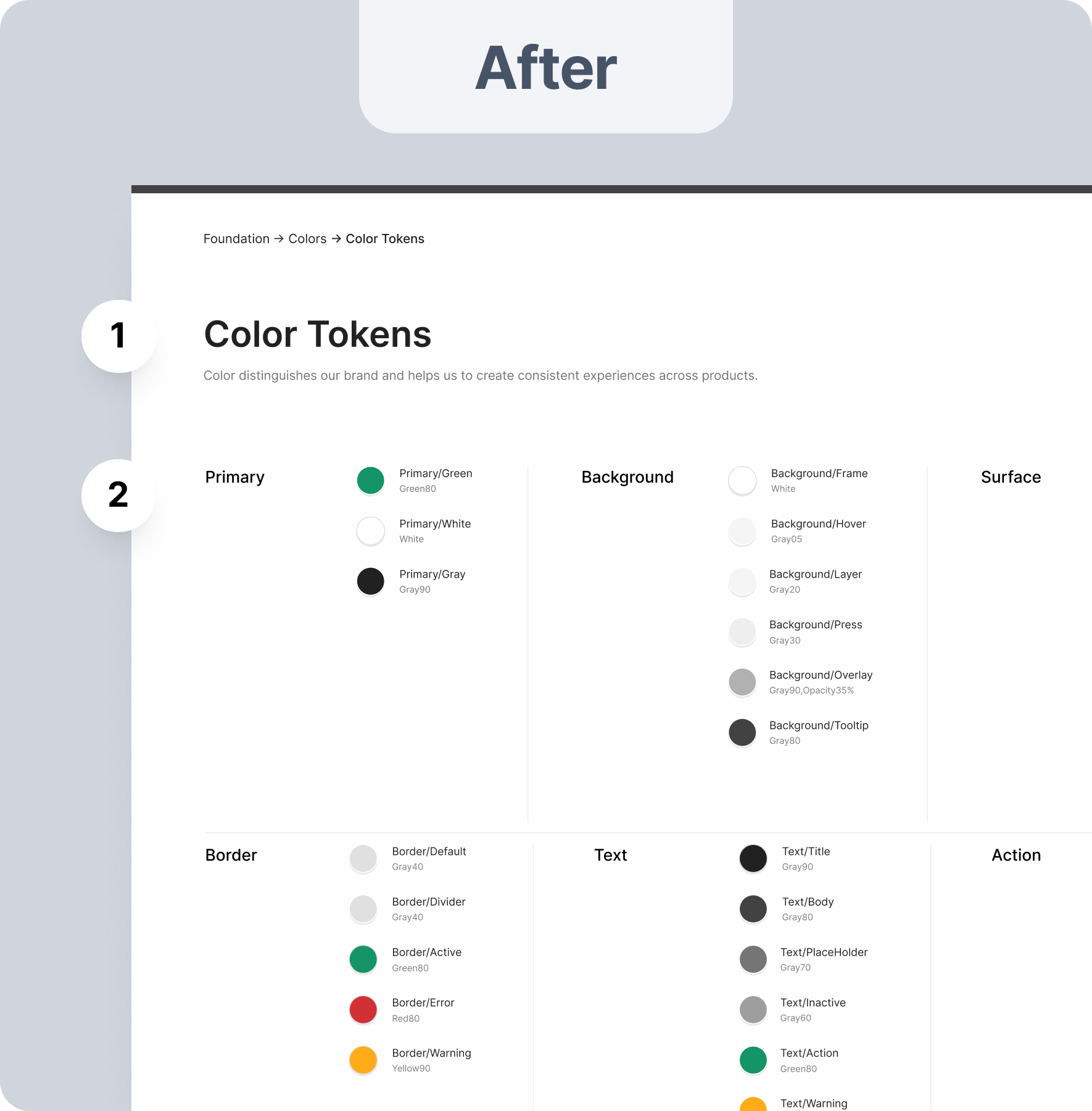
The color codes are fixed and cannot be altered
Colors have clear usage tokens (background, text, surface, action, etc.)
Contrasts are ensured to comply with WCAG standards
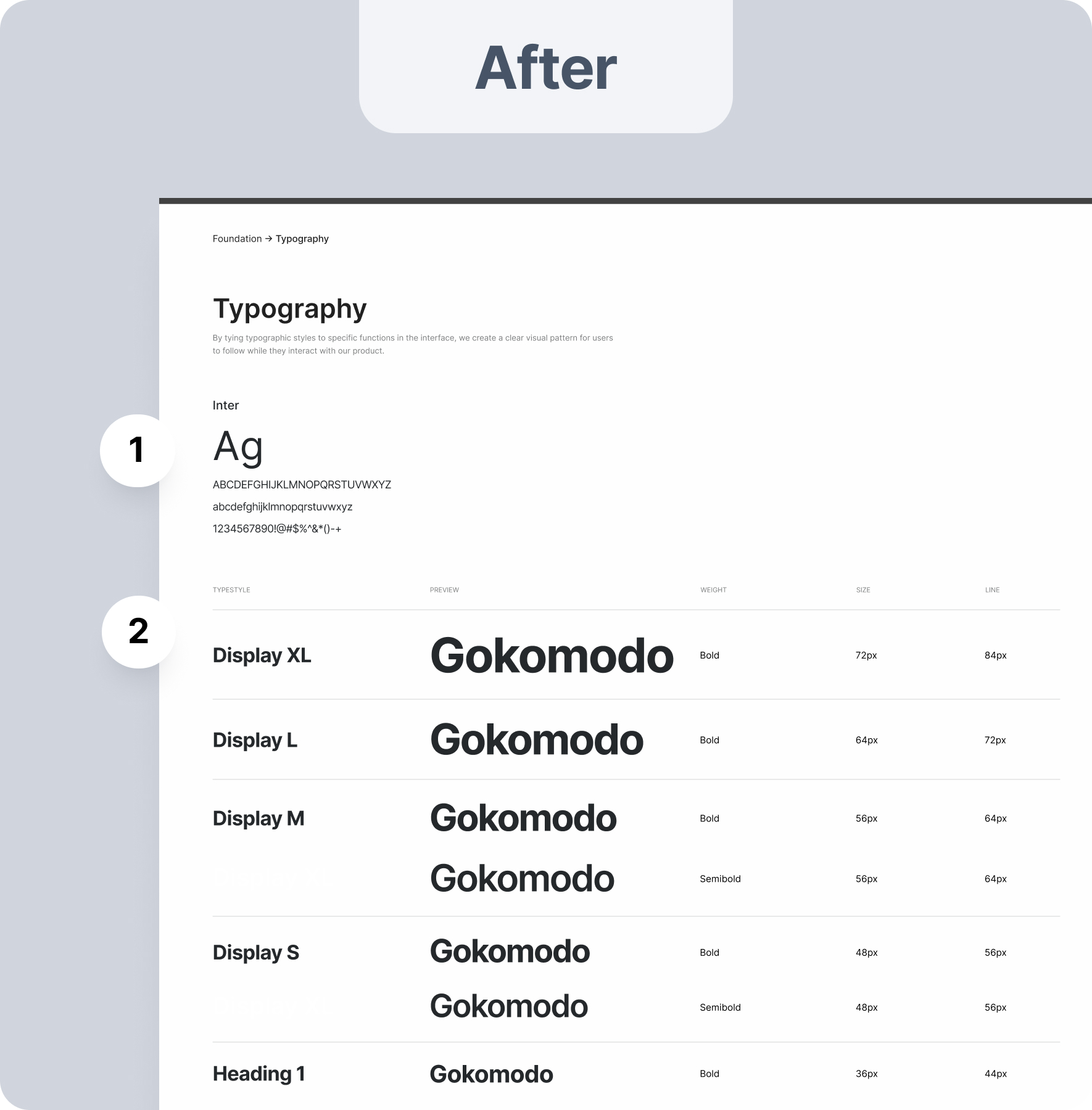
Typography exploration
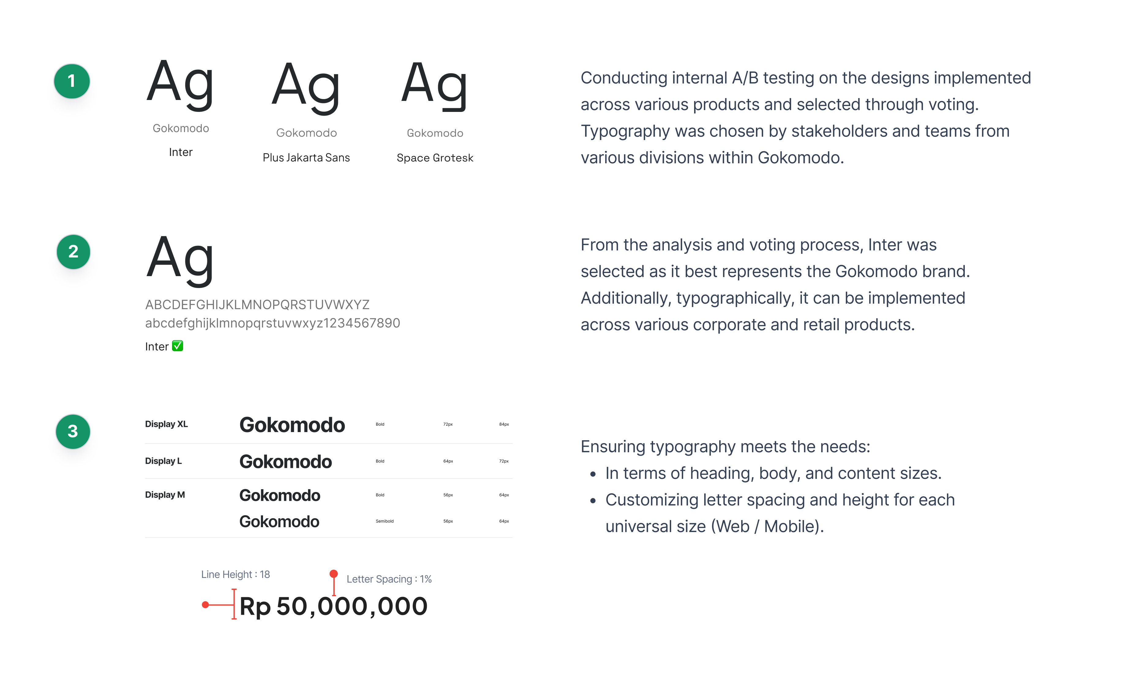
Typography is adjusted based on internal A/B testing results and voting. The Inter typography is considered to represent the needs of various Gokomodo products.
Typography exploration and testing with internal team
Old typography & new typography
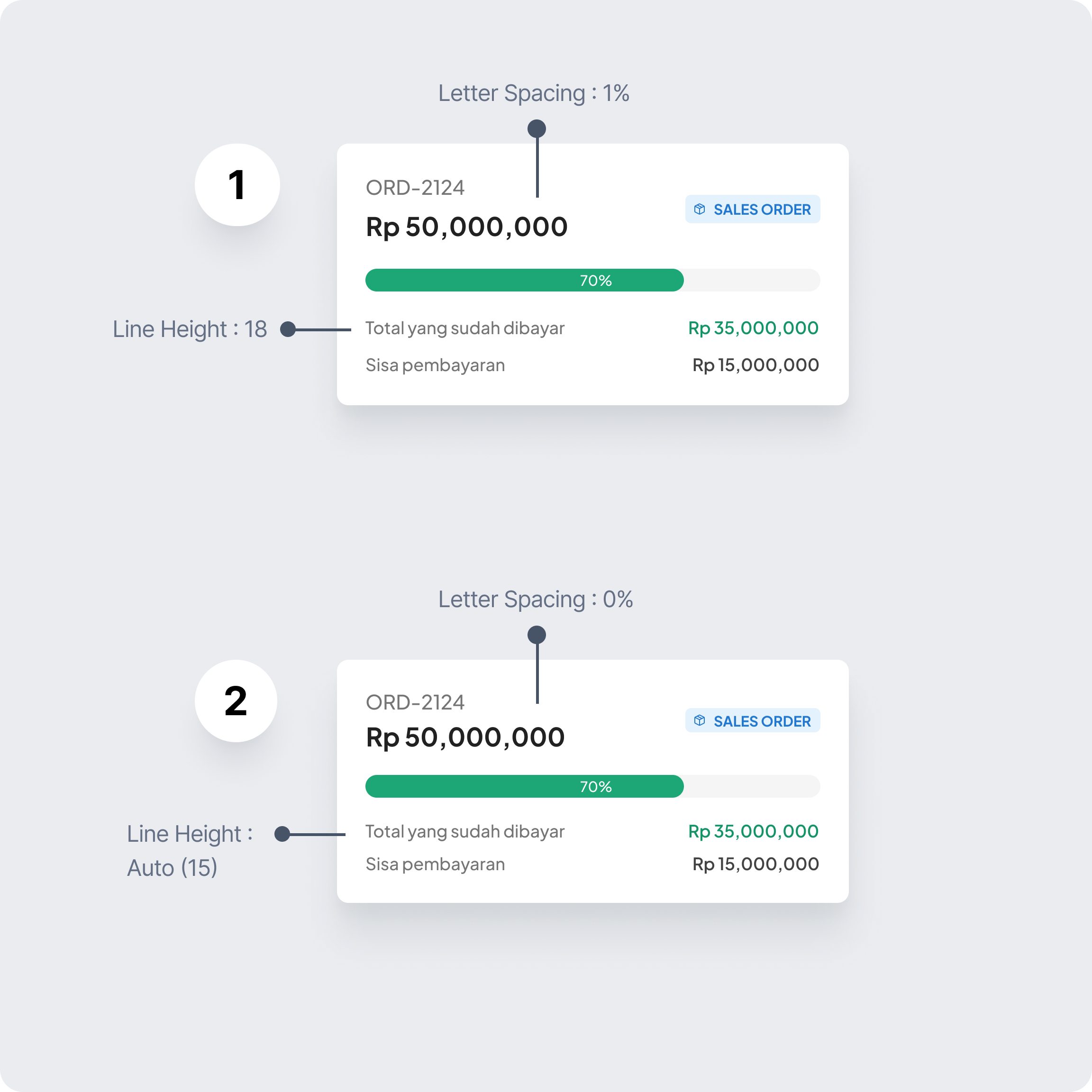
The chosen text for Gokomodo products is Inter:
- Typography consists of Display, Heading, and Body as needed for each platform and product.
- Typography has been adjusted with custom line height and letter spacing.
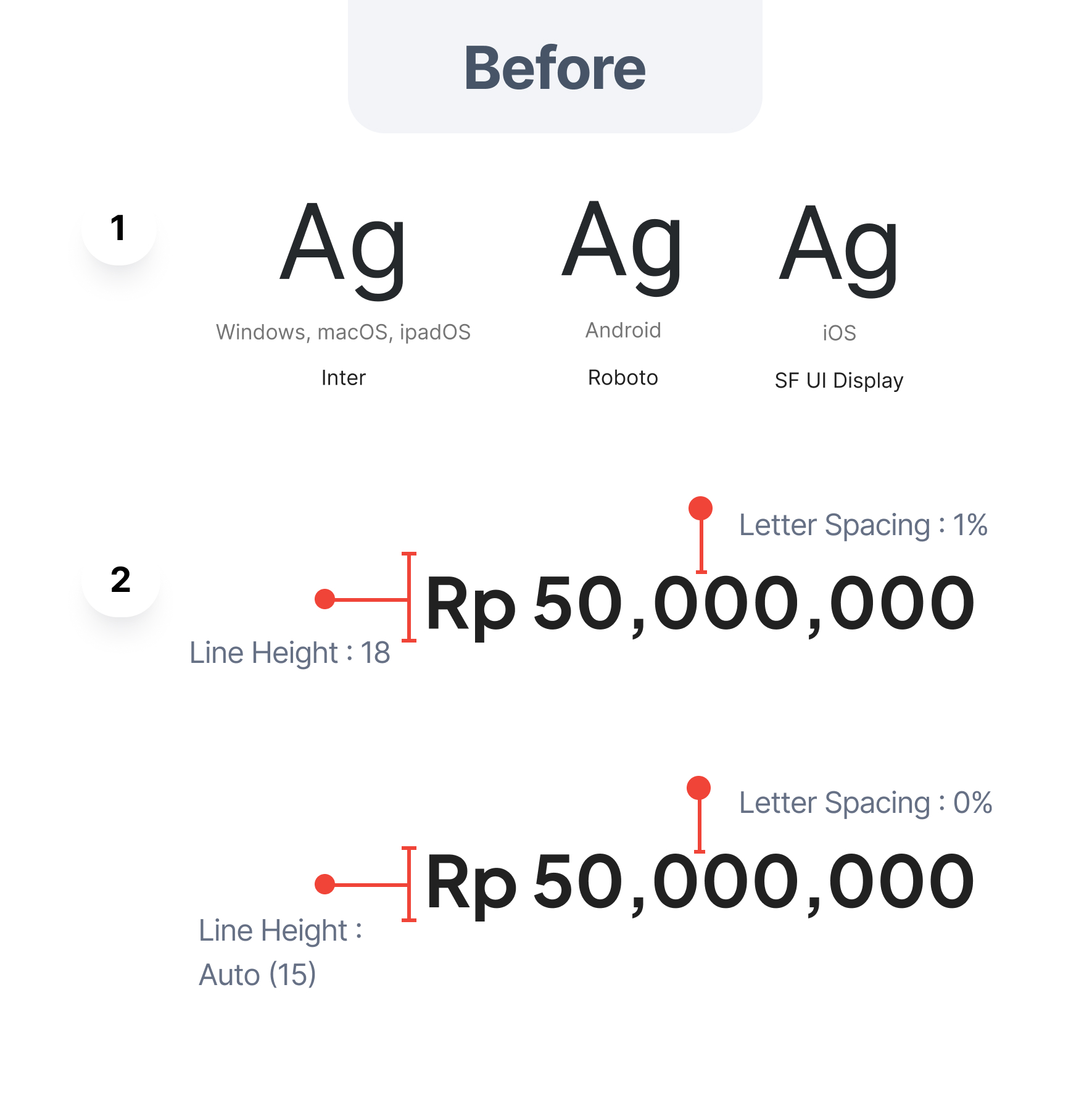
The typography is too diverse and varies across each device
Line height and letter spacing differ among designers
The typography has been selected based on internal A/B testing
Typography maintains consistency for display, heading, and content.
Typography is ensured to have custom standard line height and letter spacing.
Iconography exploration
Inconsistent lists of icons can be corrected and made more consistent and visually prominent for various products.
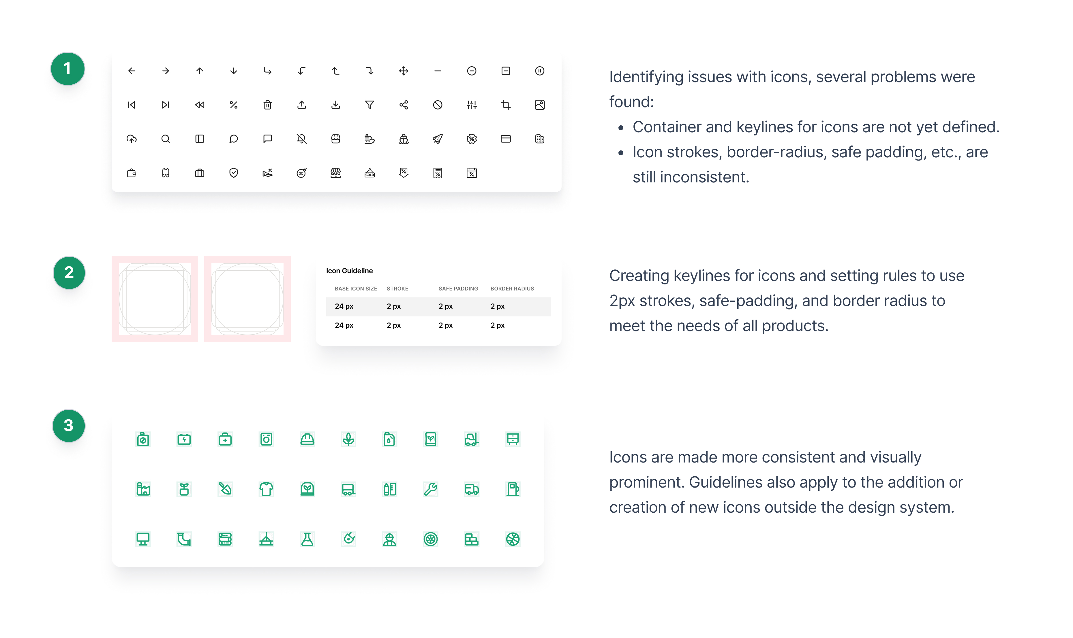
Iconography research and exploration
Old icon & new icon
Icons are made more consistent and prominent with a universal size of 24px:
- Adjustment of icon border radius to 2px.
- Making stroke consistent at 2px.
- Setting safe padding for icons to 2px.
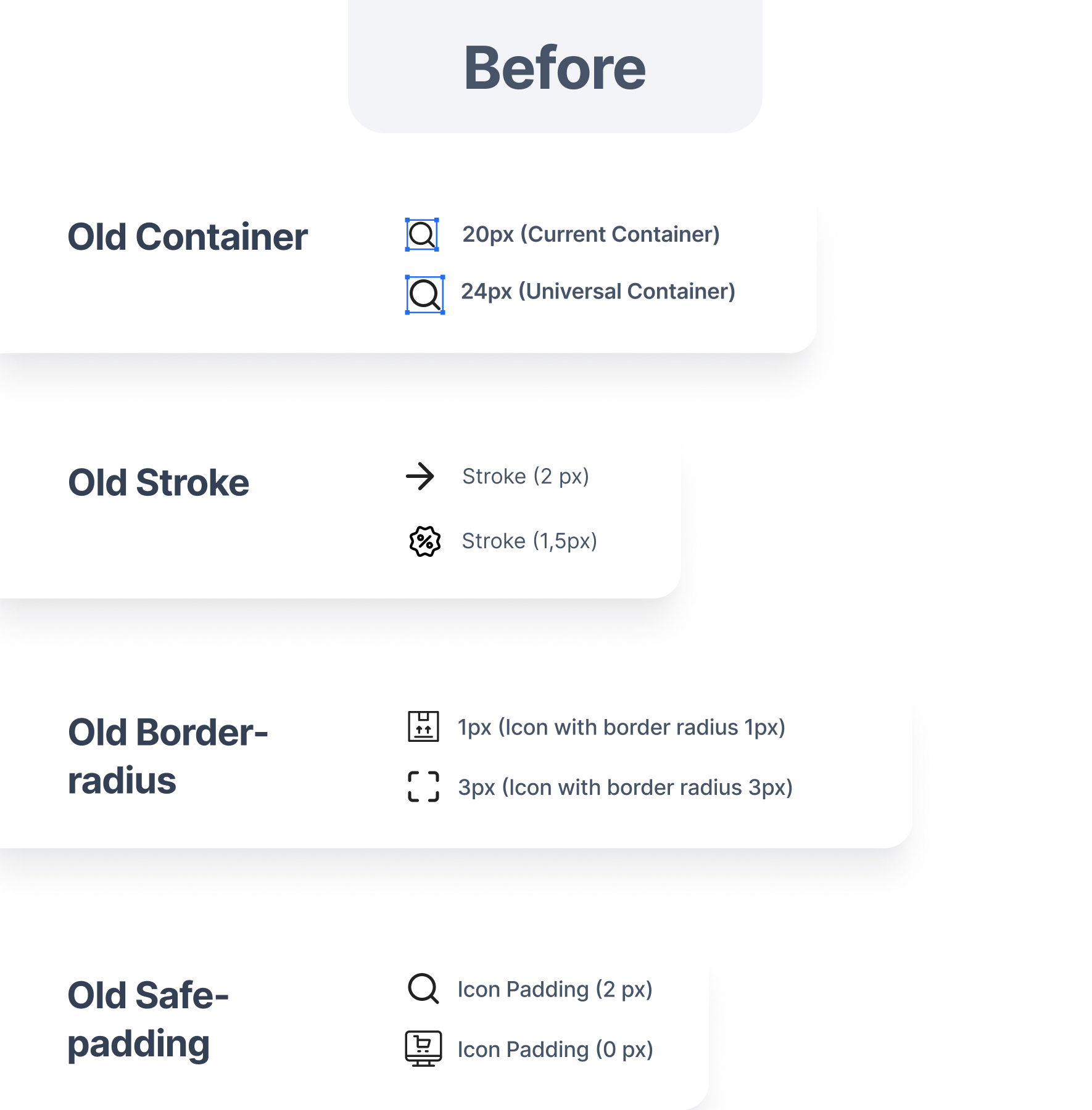
The old icons have strokes of 2px and 1.5px.
Border radius varies between 1px and 3px
Safe padding is set at 2px and 0px
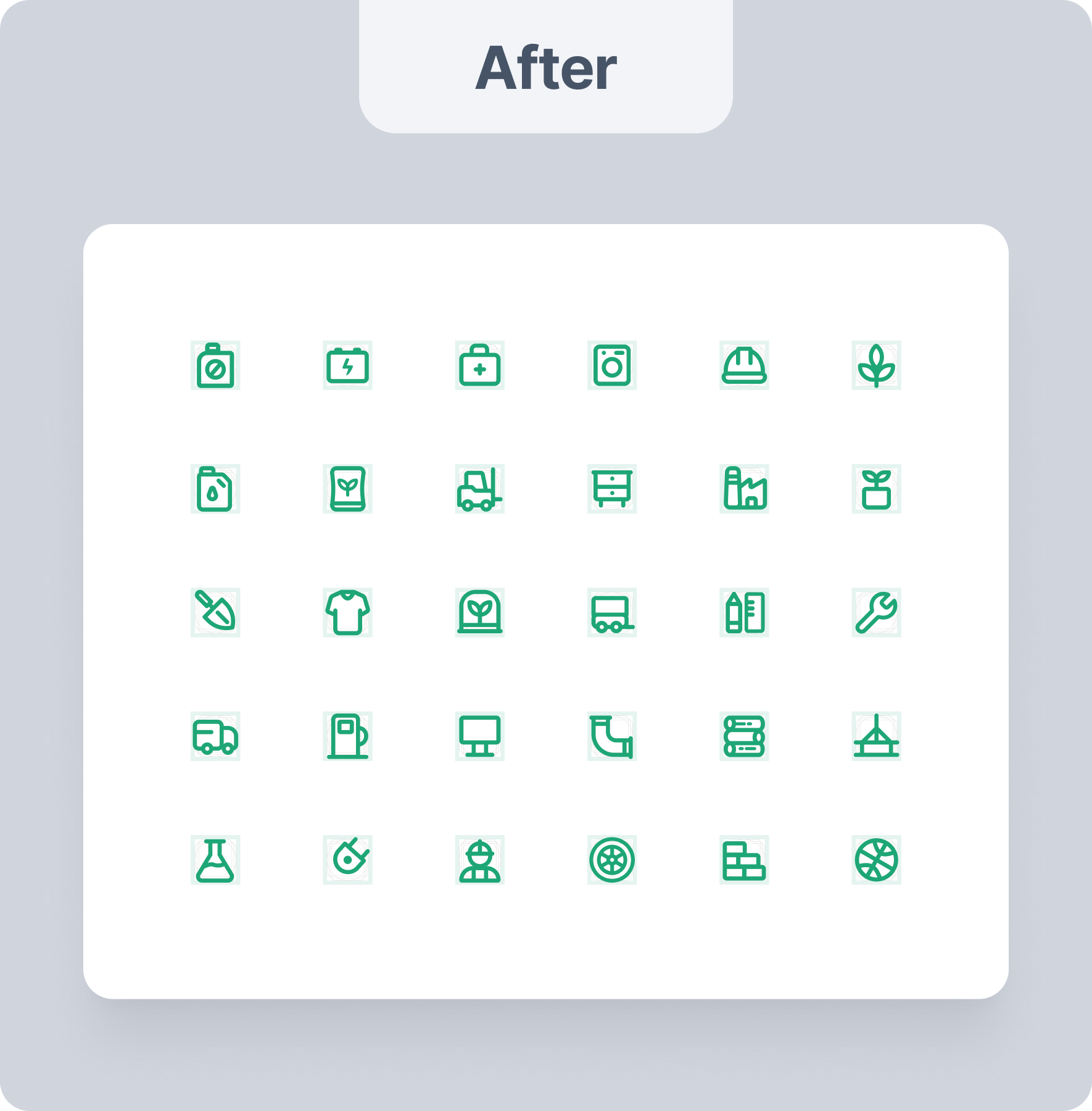
The icon container has keylines with a size of 24px
Application of the guideline formula results in 2px (for stroke, border radius, and safe padding)
Icons are consistent and visually stand out more
Documenting our visual language
Documenting every basic component to complex components:
- Identifying the types of variants within each component
- Facilitating designers and developers in understanding the usage of each component
- Adapting components according to design needs
- Design reviews to ensure every page or design element aligns with the design system.
Outcome
±80% Adoption Rate
Around 80% of components across the product have already been recreated using the foundation component. While the new project always uses this foundation component.
4.76 Satisfaction Score
The new guideline achieves a 4.76 out of 5 for ease and satisfaction scores from all designers and developers who use it.
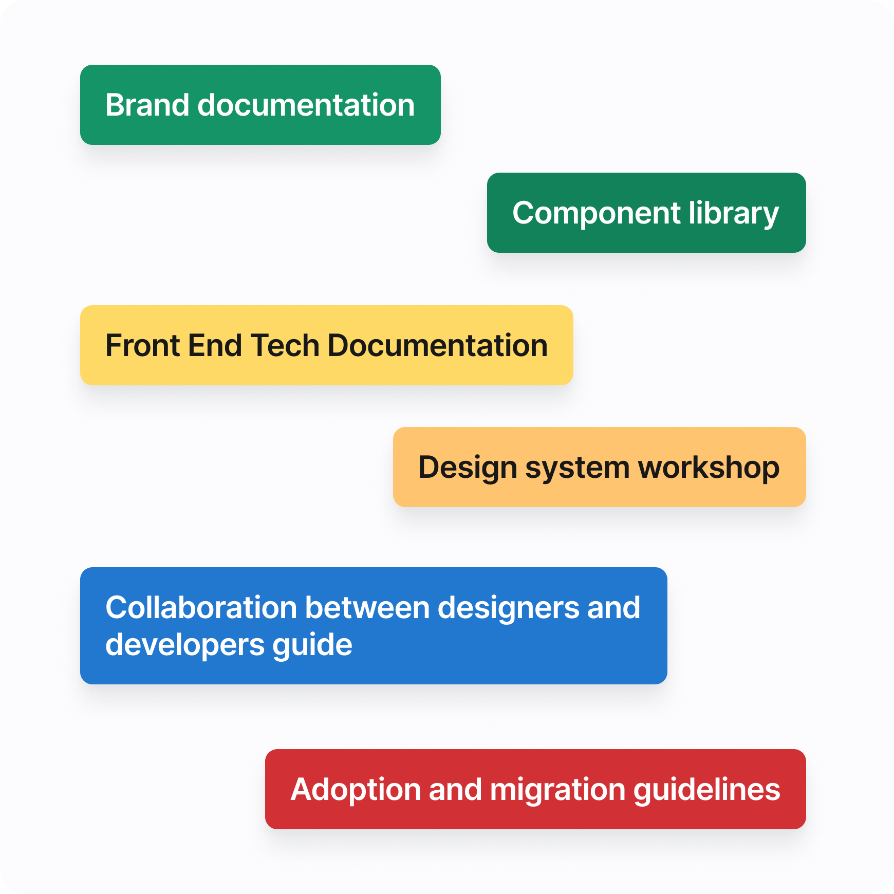
What's next?
In the future, design systems can be developed into more mature systems, including:
- Establishment of a more established Gokomodo brand with good documentation, which significantly impacts digital product design and marketing.
- Development of a component library based on component levels ranging from foundational, intermediate, to advanced components
- Front-end tech documentation to facilitate testing of components developed by designers
- Design system workshops for each tech team, product team, and stakeholders to understand the needs and urgency of the design system
- Collaboration guide between designers and developers to facilitate faster and more effective work
- Adoption and migration guidelines used for component adjustments or transitions of design tools outside of Figma
Key learnings
- Information is out there
I was very surprised on how much reliable resources were out there online. Articles from Product Designers working at big companies such as Google, Booking.com, Spectrum Adobe and more really did help us achieve this outcome. - Tools & Plugins save a ton of time
This helped us “outsource” the bulk of the work and we as Product Designers can focus more on refining and making sure that it’s heading towards the right direction. - Mathematically correct might not look visually appealing
Using tools like Stark to pair colors may be mathematically correct, but might look a bit “off”, hence why tweaks from a designer is a must when dealing with such task.
Big thanks to my design colleague and mentors Eka Prayoga, Icha Mawaddah Febriyana as Lead Designer, also Doni Wiguna as contributor member Design System during this long term project. They giving so many wrong room, criticism, suggestion and playground for my exploration.